Website Development
The new website design was developed with Andy Wardley. This is some of the story behind it.
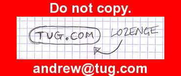
Andy kicked off with a hand drawn sketch representing the verb "tug":
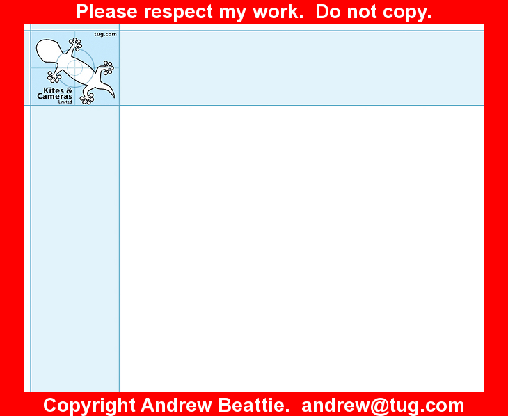
But we didn't like that very much at all. So Andy concentrated on the company name "Kites and Cameras Limited", he considered all of the shapes that we fly and settled on the gecko. He toyed with camera viewfinders. Tried a web page mockup too. He picked sky blue in pure Cyan for ease of printing.
But we still wern't heading in the right direction. Sure, the business involves kites and it involves cameras, and these come together when we take pictures of people at kite events but that is a complicated concept. We are different things to different people. Professional kite displays on one hand, professional photography on the other. A customer paying for one will have no reason to care about the other. The only reason that they are tied together is because they share assets and activities (such as vehicles) at an administrative level. The real brand is me and I am to be found at tug.com.
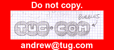
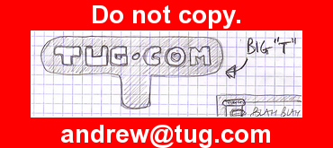
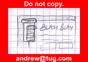
So Andy started to look at tug.com
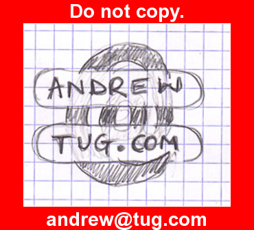
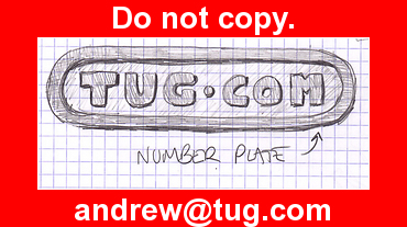
I didn't like "round and bubbly". My preference is more for "sharp", so Andy sketched more...
I liked some of the ingenuity but I didn't like the fact that it looked like a "home made" typeface. So Andy played with real typefaces:
The font "Junction" caught my eye. Just the right mix of tradition and funkyness, so next we were on to the page layout:
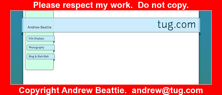
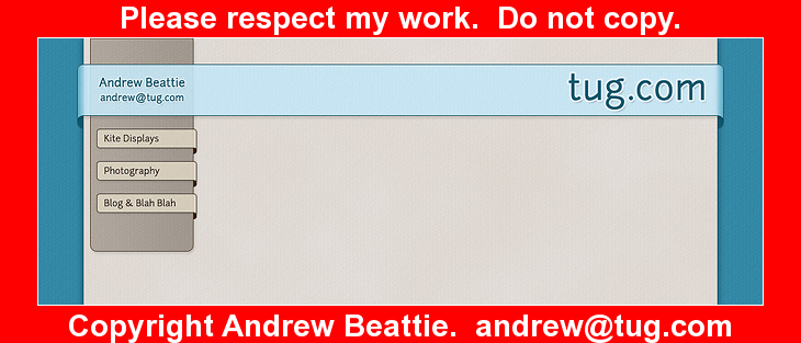
Now we were cooking on gas. The colour band wasn't too wide. We had some left/right balance, menu ideas. Andy tried "squarer" and different colours:
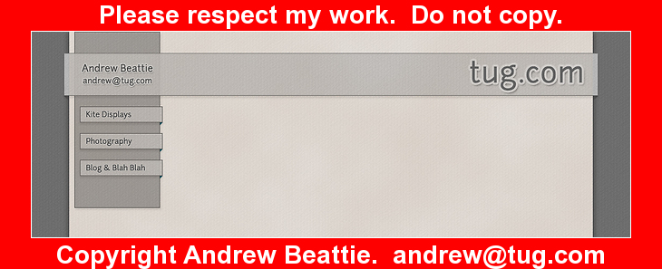
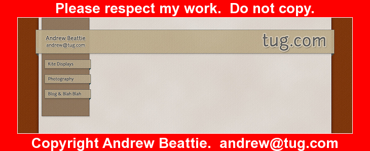
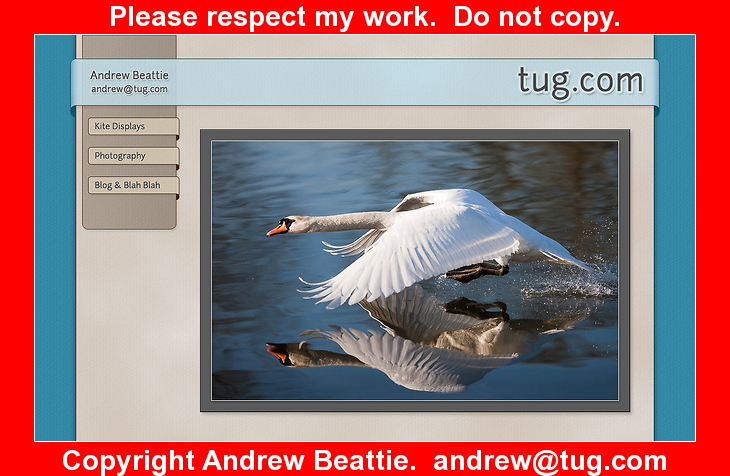
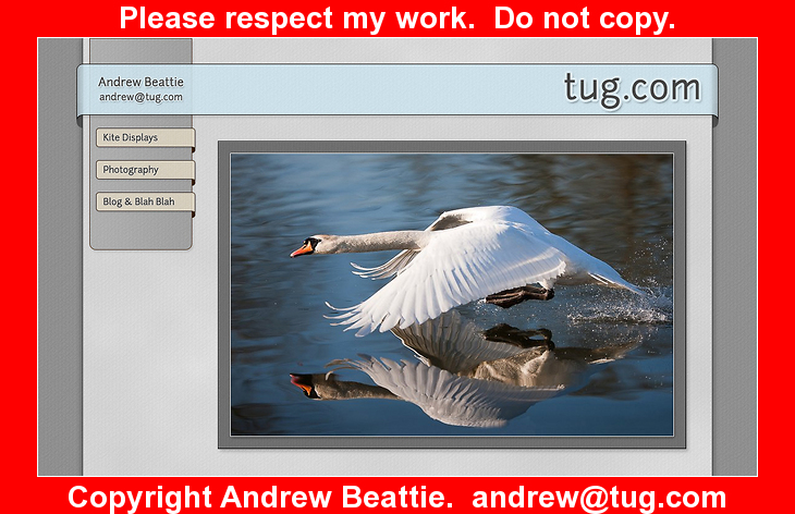
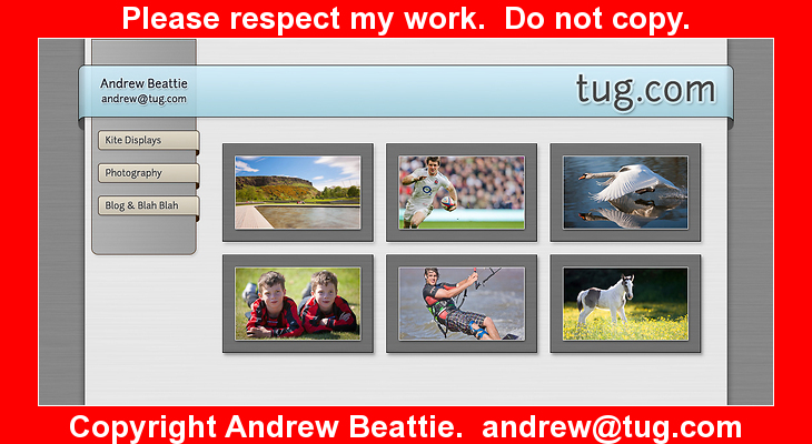
The pure grey pallet of Adobe Lightroom appealed to me to we toyed with that and other colour and texture combinations:
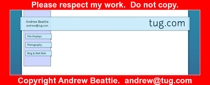
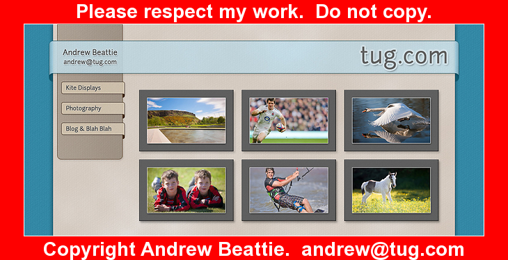
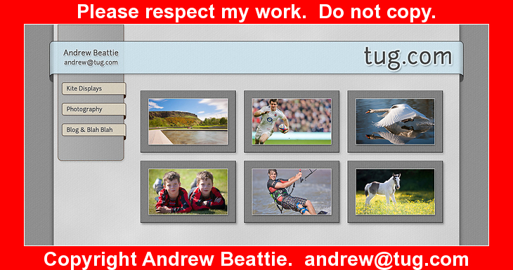
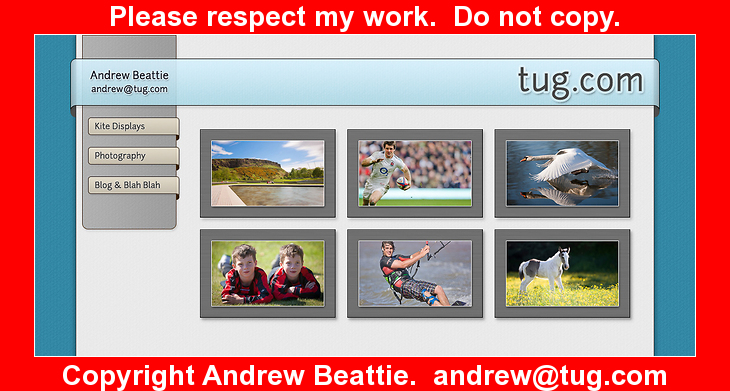
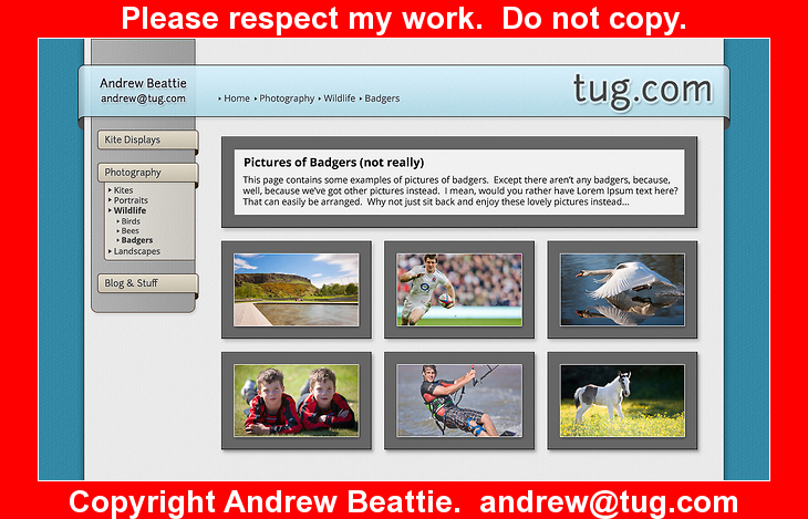
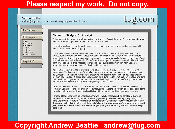
And we were pretty much there from a design point of view. The warm colours balance the cool ones. It looks professional. Later we lost the heavy frame round text and added a footer but we had settled on a design we like. Of course, that is just the graphic design. There is a whole heap more that went on under the covers, but that's all technical. Maybe another blog entry later.

